Hand-Drawn Table Maker
Present exact values with a sketch-style table format that is easier to discuss in meetings.
No signup required • Free forever
Use Tables for Precision, Not Decoration
Tables are ideal when stakeholders need exact values, not approximations. This page is built for reporting workflows where precision and readability matter equally.
Recommended Workflow
- Define one decision the table should support.
- Keep only columns needed for that decision.
- Order rows logically by rank, sequence, or priority.
- Add one highlighted row or column for the key takeaway.
Common Table Pitfalls
- Mixing unrelated metrics in one grid.
- Unclear column names and inconsistent units.
- No visual emphasis for critical values.
If your story is about pattern direction rather than exact values, move to line charts or bar charts for faster interpretation.
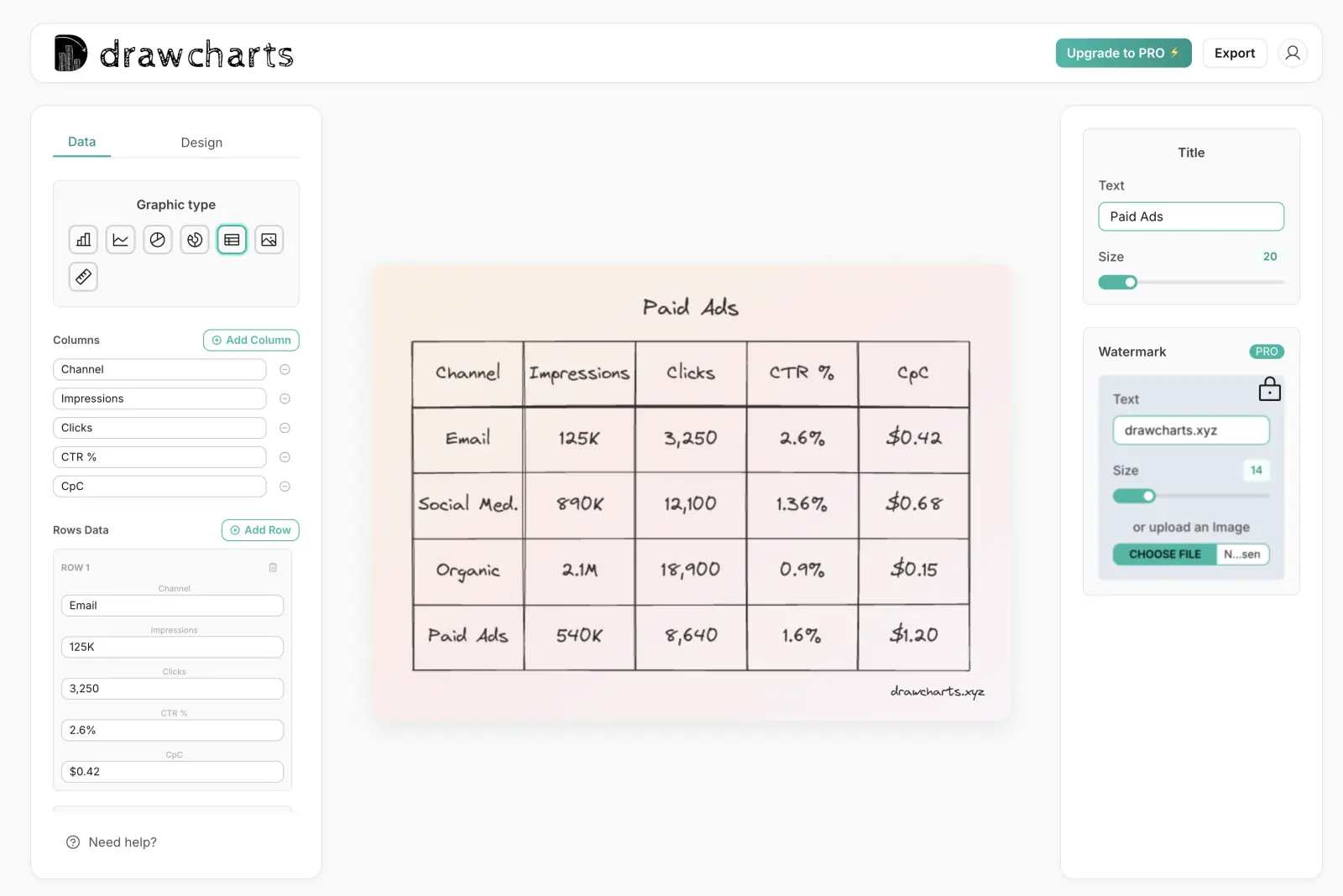
Table Example
Fast Data Input
Paste directly from spreadsheets and CSVs.
Readable Styling
Highlight values without visual overload.
Scalable Export
Generate outputs for reports, print, and slides.
Table Maker FAQs
Use table-focused workflows when decision quality depends on exact values.
Use tables when exact numbers matter and readers need to compare specific values, not only general trends.
For presentations, keep primary tables to four to eight columns. Move secondary fields into supporting tables.
Yes. Use subtle visual emphasis for priority rows, exceptions, or top-performing values to guide scanning behavior.
Packing every possible metric into one view. Break complex data into smaller thematic tables with clear headings.
Need help with a specific use case?
Share your chart goal and we can suggest the fastest setup.