Pie Chart Maker
Explain proportion and composition with sketch-style pie and donut charts.
No signup required • Free forever
Best Use Cases for Pie Charts
Pie charts work when your audience needs a fast visual for composition. They answer questions like "What share does each category contribute?"
- Budget share: Allocation across teams or functions.
- Channel mix: Traffic or conversion share by source.
- Survey responses: Distribution across answer categories.
Simple Workflow
- Keep only categories that matter to one decision.
- Sort from largest to smallest for predictable scanning.
- Use strong contrast for the key segment and muted tones for others.
- Write a headline that states the dominant share clearly.
If This Chart Feels Crowded
Convert crowded pies to bar charts to preserve ranking clarity. For overlap analysis, use venn diagram maker. For process context, combine with diagram maker visuals.
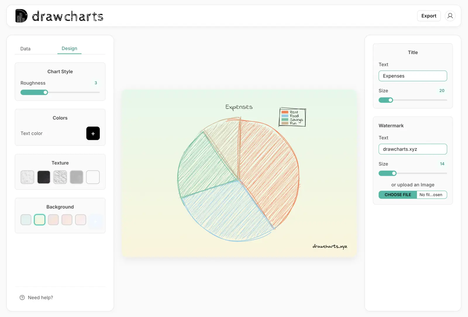
Pie Chart Example
Pie Chart Maker FAQs
Use these rules to keep proportion charts understandable on first glance.
Aim for two to six slices. More slices usually make comparisons hard and reduce the value of the chart.
Avoid pie charts when categories are too close in size or when users need precise numeric comparison. Use a bar chart instead.
Yes. Donut variations work well when you need central labels or a cleaner visual balance for small slide spaces.
Include category name and percentage. Add raw values only if they are needed for decisions and do not clutter the chart.
Need help with a specific use case?
Share your chart goal and we can suggest the fastest setup.