Line Chart Maker
Show trend direction, turning points, and momentum with sketch-style line charts.
No signup required • Free forever
When to Use a Line Chart
Line charts are built for one job: make change over time obvious. They are ideal when the audience needs to understand direction, pace, and breakpoints.
Recommended Workflow
- Define the period and reporting interval before plotting.
- Remove gaps, outliers, or duplicate timestamps from raw data.
- Use consistent axis increments and clear date labels.
- Add one annotation for the most meaningful trend change.
Mistakes That Hurt Readability
- Too many lines in one chart with no visual hierarchy.
- Mixing units on the same axis without clarification.
- Skipping context for spikes, dips, or plateaus.
If your message is category ranking instead of trends, switch to bar charts for faster comprehension.
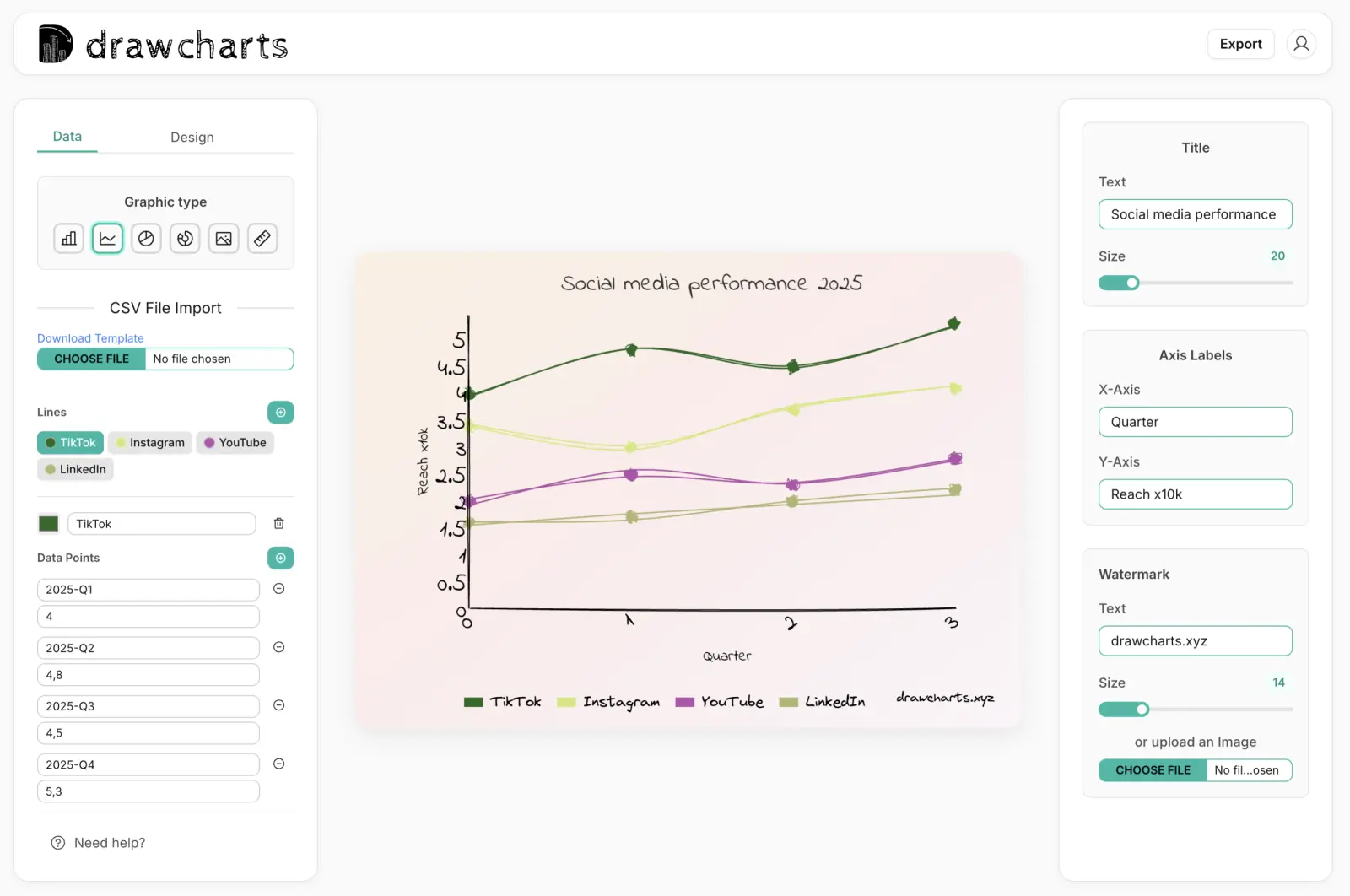
Line Chart Example
Line Chart Maker FAQs
Use this checklist to publish line charts that explain time-series movement clearly.
Use line charts for time-ordered values such as weekly signups, monthly revenue, retention, and latency trends.
Not always. Keep enough points to show direction, but reduce noise when short-term volatility hides the real trend.
Aim for one to three lines. Beyond that, line crossings and legends can reduce readability in presentation settings.
Add a brief callout at the inflection point with the event, date, and reason so viewers connect data movement to context.
Need help with a specific use case?
Share your chart goal and we can suggest the fastest setup.