Bar Chart Maker
Turn category data into sketch-style comparisons that are easy to scan and discuss.
No signup required • Free forever
Use Cases That Fit Bar Charts Best
Bar charts are the highest-signal format for direct comparisons. They work best when viewers need to answer one question quickly: "Which category is higher, lower, or improving?"
- Business updates: Compare revenue by segment, channel, or quarter.
- Product reporting: Rank feature usage, conversion by flow, or churn reasons.
- Education: Compare test scores, participation rates, and assignment completion.
Workflow for Better Bar Charts
- Limit to one comparison question and one audience.
- Sort categories by value or business priority.
- Use one highlight color for the key category.
- Write a title with the insight, not only the metric name.
Common Mistakes to Avoid
Avoid category overload and decorative colors. If you need trend context, pair this page with the line chart maker and separate comparison from time-series analysis.
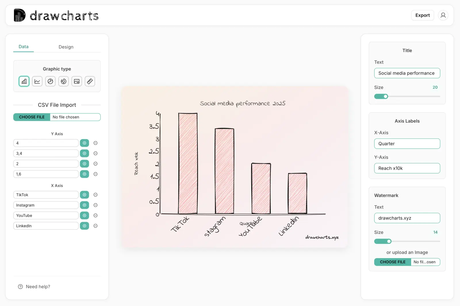
Bar Chart Example
Export Fast
Use PNG or SVG for decks and docs.
Style Control
Tune roughness, labels, and emphasis.
Quick Iteration
Draft multiple versions in minutes.
Bar Chart Maker FAQs
Practical guidance for turning category data into clear bar-chart storytelling.
Use bar charts when precise comparison matters across multiple categories. Pie charts work better for small part-to-whole stories with fewer segments.
For presentations, keep it between 5 and 12 categories. If you need more, split into grouped views or multiple charts.
Yes. Keep most bars neutral and apply one accent color to the main takeaway bar so viewers identify the message in seconds.
Over-labeling. Too many labels, legend entries, and colors reduce clarity. Start with minimal labels and add only what supports decisions.
Need help with a specific use case?
Share your chart goal and we can suggest the fastest setup.